Tutorials
Easy Graffiti Letters Step by Step: Best Starter Letters and Words
Learn easy graffiti letters step by step by starting with low-friction letter shapes, picking easier practice words, and avoiding hard-letter combos too early.
Published Mar 18, 2026 · Updated Mar 22, 2026 · 12 min read · By SprayShift Editorial
Quick Answer
Easy graffiti letters come from predictable shapes, not extra style. Start with I, L, C, O, E, and H, build one short word such as ECHO or CHILL, and do not graduate to K, R, A, Y, or Z until your spacing stays clean for a few sessions in a row.
Who This Is For
Beginners who want a first clean win, plus improving writers who know the basic process already but keep sabotaging themselves with hard words too early.
Table of Contents
- An easy graffiti letter is predictable, not plain
- Start with I, L, C, O, E, and H before you chase the whole alphabet
- Easy words teach faster than random alphabet drills
- Your first page should look quiet
- Why this simple wall piece still feels finished
- K, R, A, Z, and Y are not evil, but they gang up on beginners
- Use a 20-minute ladder instead of a random long session
- When to add harder letters
An easy graffiti letter is predictable, not plain
The easiest graffiti letters are not the letters with the least personality. They are the letters that let you repeat one clean move without solving a brand-new puzzle every few seconds. Straight stems, open curves, and obvious counters leave enough room to notice rhythm, and rhythm is what beginners usually miss first.
That is why simple letters teach so much. They let you see when the baseline slides, when one bar gets fatter than the rest, or when the inside space drifts off-center. A beginner O often looks fine on the outside and wrong on the inside. That is useful information, because it tells you the problem is control, not imagination.
A lot of people think plain practice is a waste of time. It is usually the opposite. The first page should feel almost boring. A boring page with honest spacing will teach you more than a dramatic page that needs rescuing from the second letter onward.
- Use letters that repeat simple stems or open curves
- Keep one height rule across the whole word
- Pick one outside-shape language: mostly straight or mostly rounded
- Do not add arrows, cuts, or drips until the word already reads clean
Start with I, L, C, O, E, and H before you chase the whole alphabet
These starter letters cover most of the beginner problems without overwhelming you. I and L force you to respect height. C and O teach curve control and centered counters. E and H make you deal with repeated bars and cross-stroke placement without adding diagonal drama.
One non-obvious thing: repeated stems expose cheating fast. In a word like CHILL, you cannot hide a weak cap height or a wandering baseline for very long. The whole word starts snitching on you immediately.
This is why easy letters are so useful. They do not flatter you. They show you the real issue early enough that you can still fix it.
| Letter | What it teaches | Common beginner miss |
|---|---|---|
| I | Height control and even bar weight | Making one stem much heavier than the others |
| L | Clean corners and a stable foot | Letting the foot shoot too far out |
| C | Open curve control | Closing the opening too soon |
| O | Centering the counter | Getting the outside shape right but the inside wrong |
| E | Three bars that still feel balanced | Top and bottom arms drifting to different widths |
| H | Two stems plus one bridge | Placing the bridge too high and stiffening the letter |
Easy words teach faster than random alphabet drills
The fastest shortcut is not a secret style. It is word choice. Short words such as ECHO, CHILL, COOL, and HELLO stay easy from left to right, so you can actually judge the whole piece instead of fighting one ugly diagonal in the middle.
This is different from random alphabet drilling. Alphabets are useful later, but on day one they let you avoid comparison. A real word forces the letters to live next to each other, and that is where spacing mistakes become obvious.
There is a sweet spot here: enough variety to teach you something, not so much variety that the page becomes a rescue mission. One curve-heavy letter inside an otherwise calm word is plenty for the first session.
- ECHO gives you one curve, one round letter, and two steady stems in the same word.
- CHILL is excellent when you want repeated bars to reveal baseline drift fast.
- COOL lets you practice round shapes without turning the whole sketch into circles.
- HELLO has simple stems with just enough softness to keep the rhythm from dying.
Your first page should look quiet
When graffiti letters are supposed to feel easy, the process should feel easy too. You do not need ten layers. You need an order that catches the mistake while it is still small.
Use ECHO as the training word here. It gives you one curve, one circle, and a couple of stems. That is enough variety to teach you something, but not enough to bury you under decisions.
The real skill is restraint. If the E already feels too wide or the O counter starts drifting, stop there. Do not reward a shaky build with more style.
- Skeleton pass: draw the center structure lightly so height and width feel even before you outline anything.
- Outer-build pass: wrap the letters with one simple contour and keep the thickness close from letter to letter.
- Spacing pass: compare the air between E-C, C-H, and H-O, then nudge the pairs that feel pinched.
- Finish pass: add one restrained shadow or inline only after the word already reads in plain black and white.
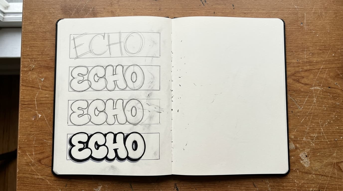
The point of the first page is clarity, not fireworks: skeleton, outer build, spacing cleanup, then one restrained finish pass.
Next Step
Try One Easy Practice Word
Run one low-friction word such as ECHO or CHILL so you can judge rhythm, spacing, and bar weight before you add more style.
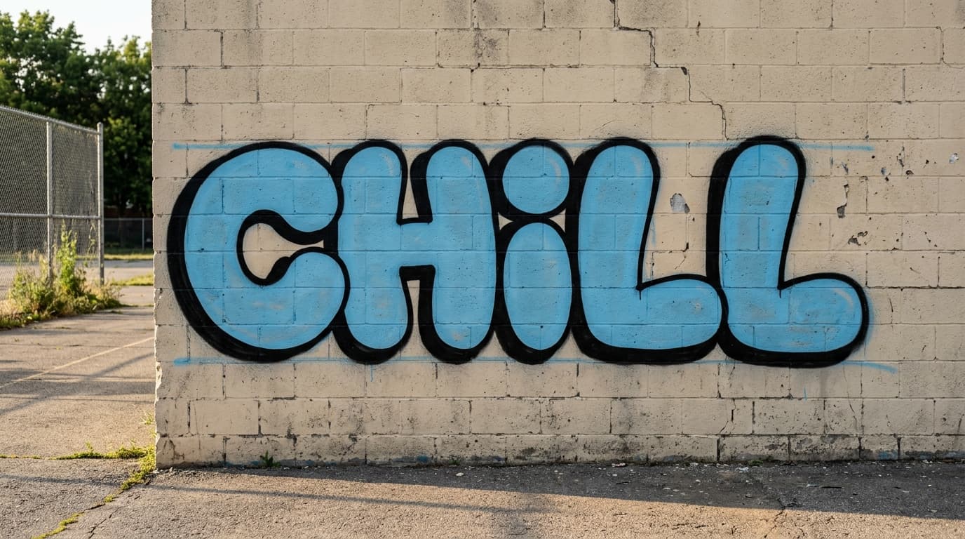
Why this simple wall piece still feels finished
This ECHO piece works because it is not trying to prove anything. The bars are fat enough to read from across the lot, the corners stay simple, and the shadow behaves like a support layer instead of a stunt.
There is also enough wall showing around the word. That matters more than people think. Easy graffiti dies when every letter has to lean on the next one for energy. A little breathing room makes simple shapes feel chosen instead of timid.
That is the mark of a useful beginner target. The piece feels calm, but not sleepy. If the spacing is handled well, a plain word on a rough wall can hit harder than a crowded sketch loaded with tricks.
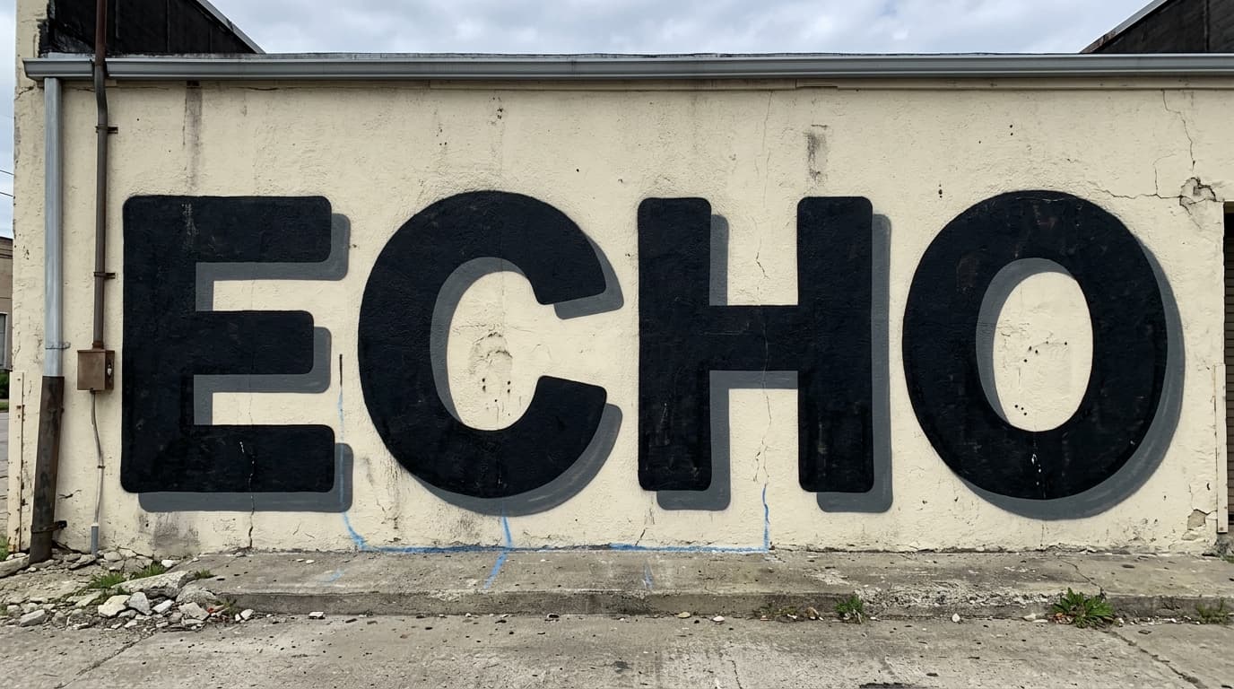
Worked example: simple outside shapes, even bar weight, and enough air between letters make this piece feel deliberate instead of undercooked.
K, R, A, Z, and Y are not evil, but they gang up on beginners
KRAZY is a classic beginner trap. It looks exciting on paper because the letters feel sharp, but it stacks diagonal joins, leg breaks, and angle changes almost the whole way through the word.
That is why this fail example falls apart so quickly. The K opens too wide, the R never settles, the A pinches the middle, and by the time the Z and Y arrive the baseline is already trying to climb uphill. None of those mistakes are huge on their own. Together they turn one practice page into five separate repair jobs.
Use words like this later. They are worth learning. They just teach better after you already have a few calm pages behind you.
- If a word has three or more diagonals, save it for later
- If one letter needs a special fix, that is normal
- If every letter needs a special fix, pick a different word today
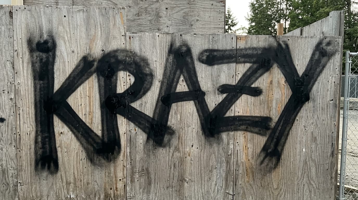
Failure example: K, R, A, Z, and Y stack too many hard decisions at once, so spacing and diagonal control collapse before the piece can settle.
Use a 20-minute ladder instead of a random long session
You do not need a marathon session to improve. You need a short loop that lets you compare one page to the next without lying to yourself about what changed.
Keep the sequence simple for a week. Stay with easy words until the build starts feeling automatic, then bring in only one tougher letter. If you change word choice, style, spacing, and outline weight all at once, you learn almost nothing.
| Minutes | Focus | Output |
|---|---|---|
| 5 | Sketch CHILL or ECHO twice | Pick the cleaner skeleton |
| 5 | Build one clean outer shape | One version with stable thickness |
| 5 | Fix only spacing and counters | One corrected version with calmer gaps |
| 5 | Swap one easy letter for one harder one | A comparison page that shows exactly what got tougher |
When to add harder letters
Move on when your easy words stop surprising you. If CHILL, ECHO, or COOL keep landing with the same spacing and the same height, you have earned the right to make the next page a little harder.
Do not jump straight from easy words into full distortion. Just trade one safe letter for one harder one. Swap the L in CHILL for a K. Replace the H in ECHO with an R. Give yourself one new problem at a time.
- Add K, R, A, Y, or Z one at a time, not all in the same first word
- Keep your line weight simple while the new letter settles
- If the harder word falls apart twice in a row, go back to one easy word plus one hard letter
FAQ
What are the easiest graffiti letters to start with?
What is an easy graffiti word for beginners?
Why do simple graffiti letters still look bad sometimes?
When should I try harder graffiti letters like K, R, or Y?
Related Reads and Next Actions
Next Step
Ready to Apply This in a Real Generation?
Pick one easy word today, make it read clean, then add only one harder letter on the next page. That is how range grows without every sketch turning into repair work.